Green Zone
Green Zone is a concept website created for an environmental NGO focused on nature conservation, community awareness, and sustainable living. The goal of the project was to design a clean and impactful digital experience that encourages people to participate in environmental activities and support eco-friendly initiatives.
Design Approach
- Mission
- Vision
- Philosophy
• Explored NGO and sustainability-based website references
• Defined visual direction using nature-inspired color palette
• Focused on clean content hierarchy and simple navigation
• Created low-fidelity layouts to structure homepage sections
• Planned a modular grid system for responsive adaptation
• Balanced text and imagery for better readability
• Bold grid-based layout with earthy tones and nature-inspired imagery
• Creates a strong visual connection with the environment
• Modern typography and structured sections for a clean, balanced interface
• Simple navigation with an engaging and user-friendly experience
Design Process
From mood exploration to final visuals, this process highlights the key steps taken to craft a playful, minimal, and user-focused design.
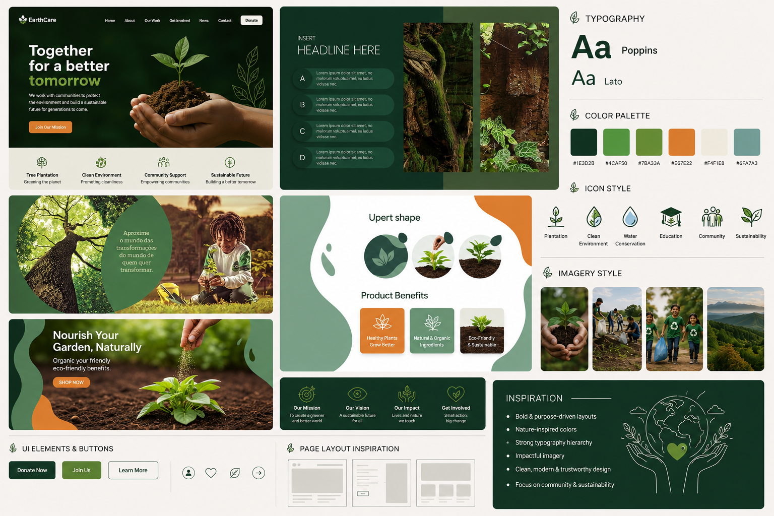
Mood Board
The mood board explores a nature-inspired visual direction using earthy tones, organic imagery, and modern layouts.
It helped define the project’s overall style, typography, colors, and UI inspiration.
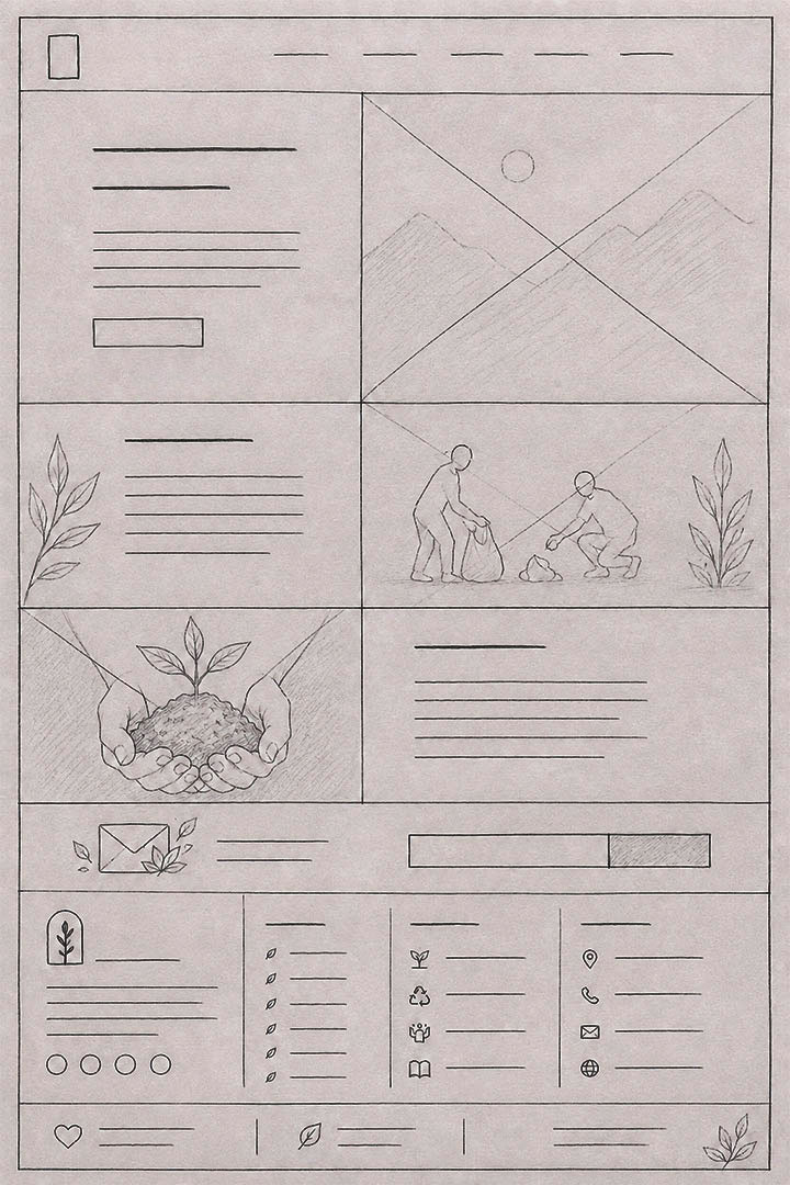
Low-Fidelity Sketch
Low-fidelity sketches were created to explore homepage layouts and content structure before the final design stage.
This process helped plan the user flow, section placement, and visual balance.
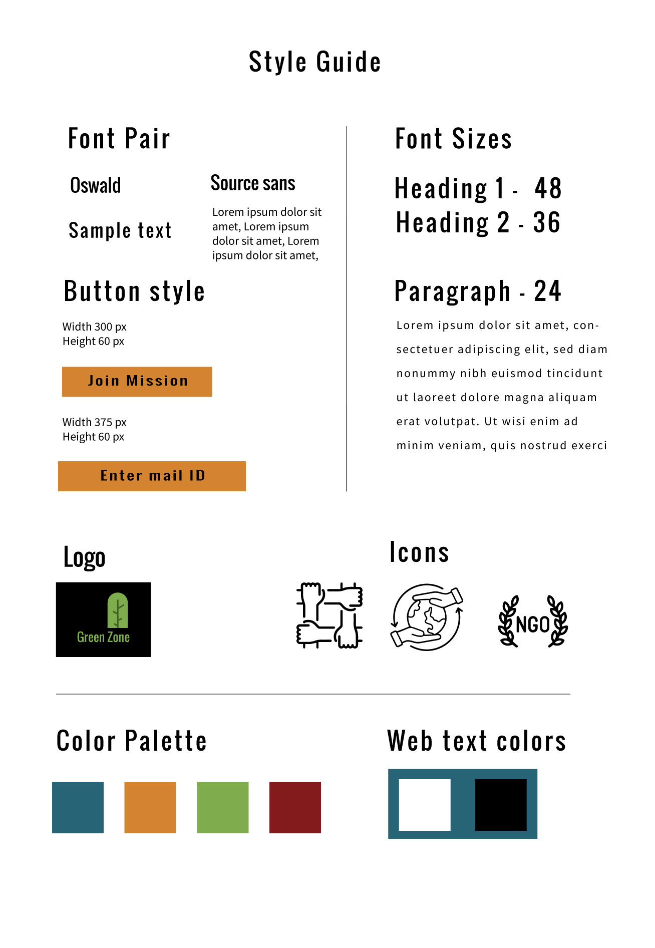
Style Guide
The style guide was created to maintain consistency across the entire website interface.
It defines the typography system, button styles, color palette, iconography, and spacing used throughout the project.
")
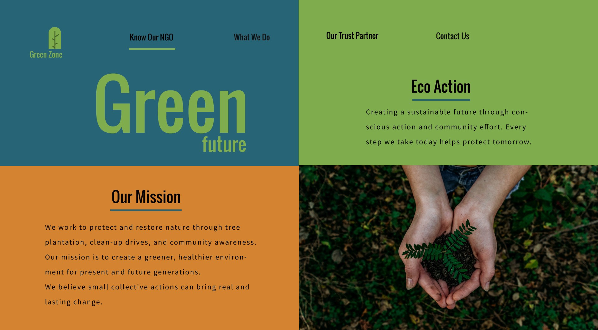
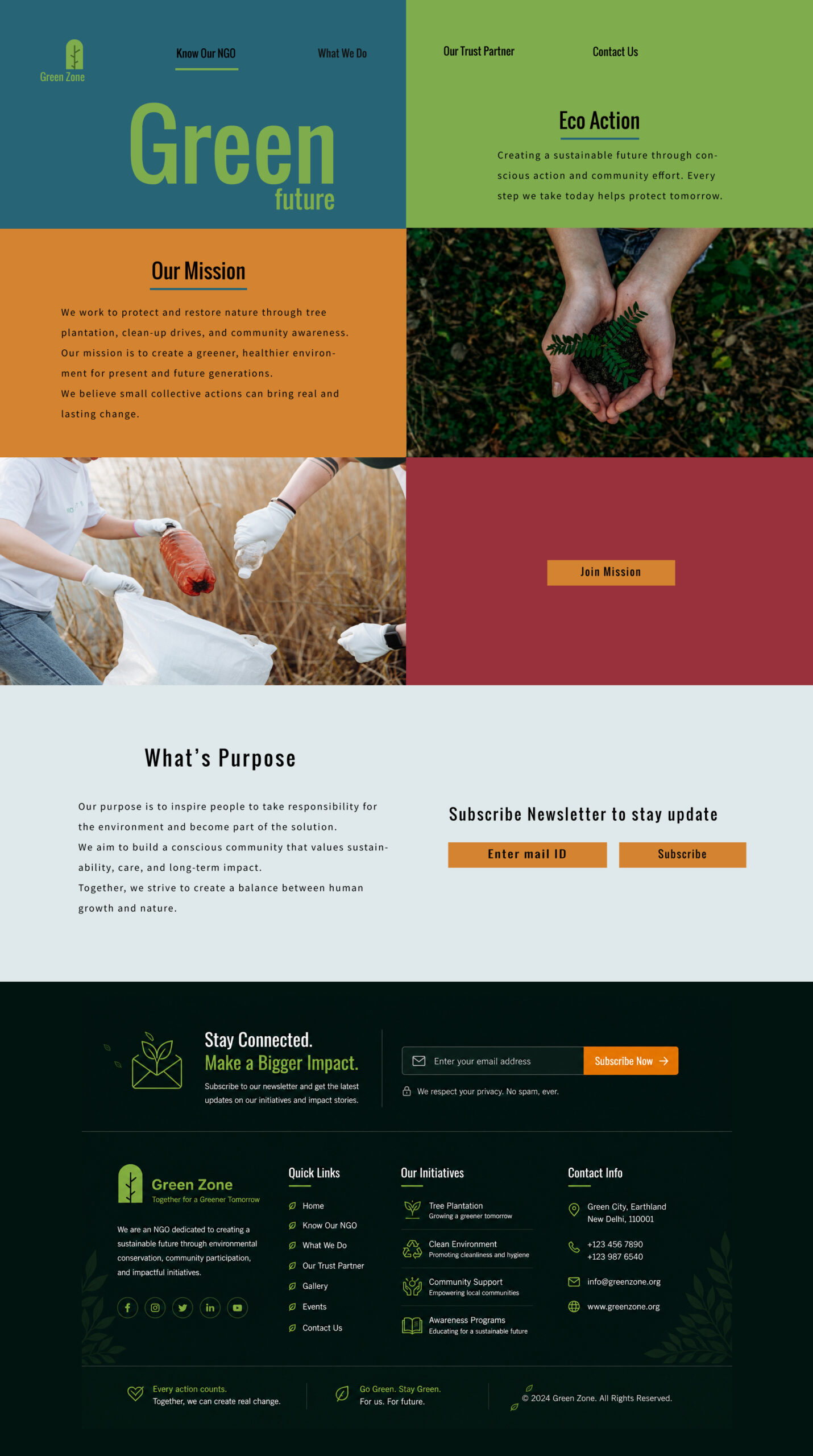
Final UI -Home
Client Requirement
Design a modern and visually engaging NGO homepage that spreads awareness about environmental conservation and community participation. The website should feel clean, impactful, and easy to navigate while encouraging users to connect with the mission and support eco-friendly initiatives.
Bold Grid Layout
Created a split-screen structure to balance storytelling and visual hierarchy.
Nature-Inspired Palette
Used earthy greens, warm orange, and deep tones to reflect sustainability and impact.
Typography Focus
Large typography was used to create strong visual emphasis and modern identity.
Community-Centered Experience
Designed sections that encourage awareness, participation, and engagement.
Conclusion
The final design creates a clean and impactful NGO experience using strong layouts, nature-inspired visuals, and clear content flow to encourage awareness and community engagement.
